
This Doesn’t Connect
The Royals’ City Connect uniform forgets what makes a uniform matter — and lands in a fountain of purple.

I’ve always loved sports uniforms.
The jerseys. The colors. The mascots. The way everything comes together — clean, unified, intentional. There’s something about the idea itself: let’s put nine guys out there (or five, or 11), all dressed the same, representing something bigger than themselves. That matters to me. It always has.
And from that, favorites develop. Then those favorites harden into something else — the ones you don’t just like, but love. The ones that stick. The ones time can’t touch.
For me, it’s always been the St. Louis Cardinals. From the first time I saw that jersey — the birds on the bat — I was done. Nothing has ever topped it. It’s perfect. It’s genius. You don’t improve on that.
Wait — Before I Get to City Connects…
Let’s rewind a second. Somewhere along the way, the Kansas City Royals made a decision. Back in 1969, when they had a blank canvas, a chance to build something completely original… they went with: “Hey, those Los Angeles Dodgers uniforms look pretty good. Let’s just… do that.”
And they did. Same script. Same clean look. Same DNA. Look, it works. It’s classic. But originality? It wasn’t exactly breaking new ground, even if they looked good.
Now — City Connects
Alright. Back to the present. The new 2026 MLB City Connect uniforms dropped this week, and I went looking for something — anything — to like. Not love. Not even really like. Just… something passable.
But here’s the thing — if you’re going to call it City Connect, then actually connect it: to the city, to the history, to the game.
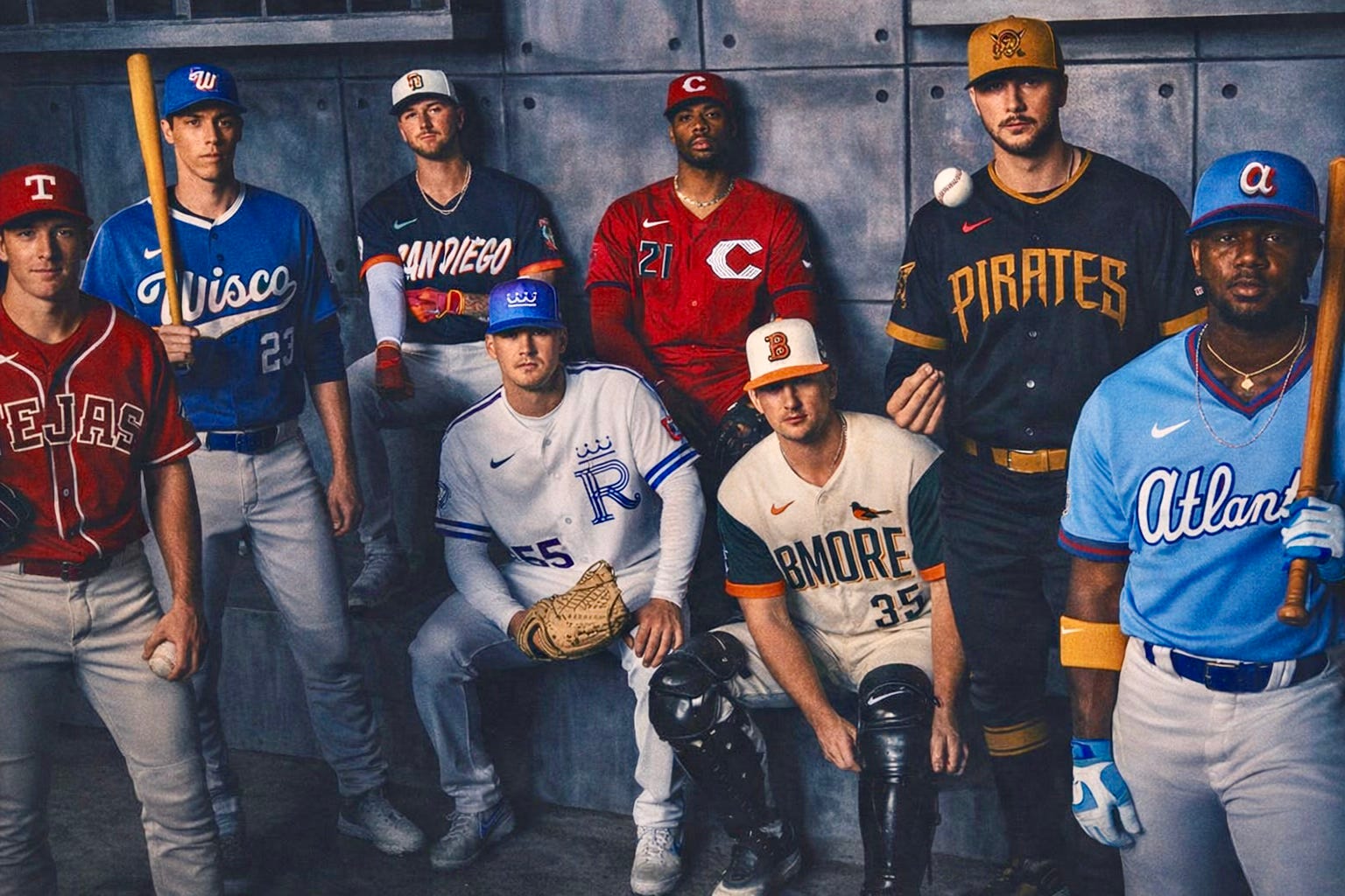
And I tried to like them. Milwaukee? Maybe. Maybe. And even that felt like I was grading on a curve. Everything else? Forget it. And the worst one? Kansas City.
Yeah. My city. My team.
The Fountain Problem
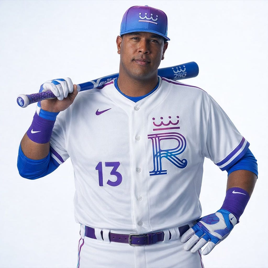
Oh, Kansas City. Another fountain-type rendition of the R.
Because Kansas City loves its fountains. We hear it all the time — City of Fountains. There are around 200 of them. Sounds impressive, right?
Until you realize Paris has six times that. So now we’ve got — what — the same stylized “R” feature splashed on the front of a jersey, with some random purple thrown in, and a cap that looks like it lost a bet.
That’s the connection? That’s the story? That’s what they’re selling?
Here’s the Thing
If you’re going to call something a City Connect, then connect it.
Connect the team to the city.
Connect the city to the history.
Connect the history to the game.
Tie it together. Make it mean something.
What They’re Saying About the 2026 City Connect Uniforms
Paul Lukas (Uni Watch)
“When you need a long explanation for a uniform, that’s usually a sign the design isn’t doing its job.”
Jeff Passan (ESPN)
“The idea behind City Connect is strong. The execution has been hit or miss.”
Jesse Rogers (ESPN)
“Some connect. Others… you’re still trying to figure out what the connection is.”
Bob Nightengale (USA Today)
“Some teams have embraced it and nailed it. Others, it feels like they’re reaching.”
So I Tried It Myself
Now, let’s be clear — I have zero design experience.
None. My process is basically: throw ideas at Knox and say, “Hey, make this look like something.” But I went digging anyway. Kansas City history — I know quite bit to start with. The city’s culture. Identity. It’s feel.
And I came up with four uniform concepts. And they’re not perfect. Far from it. But they’re honest. They’re baseball, and I think they actually connect.
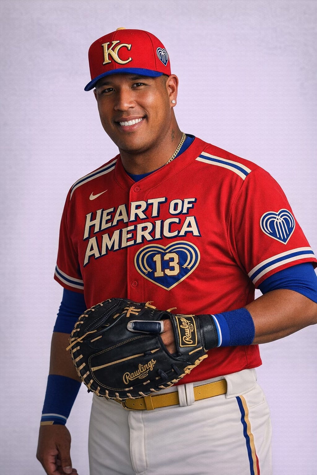
1. Heart of America
Best concept. Worst execution.
I leaned into the city flag — which, yes, includes fountains (of course it does). I tried to build something around that identity. Didn’t quite land visually. But the idea? Still strong. There’s something there. And if I took more than 15 minutes to play with it, who knows?
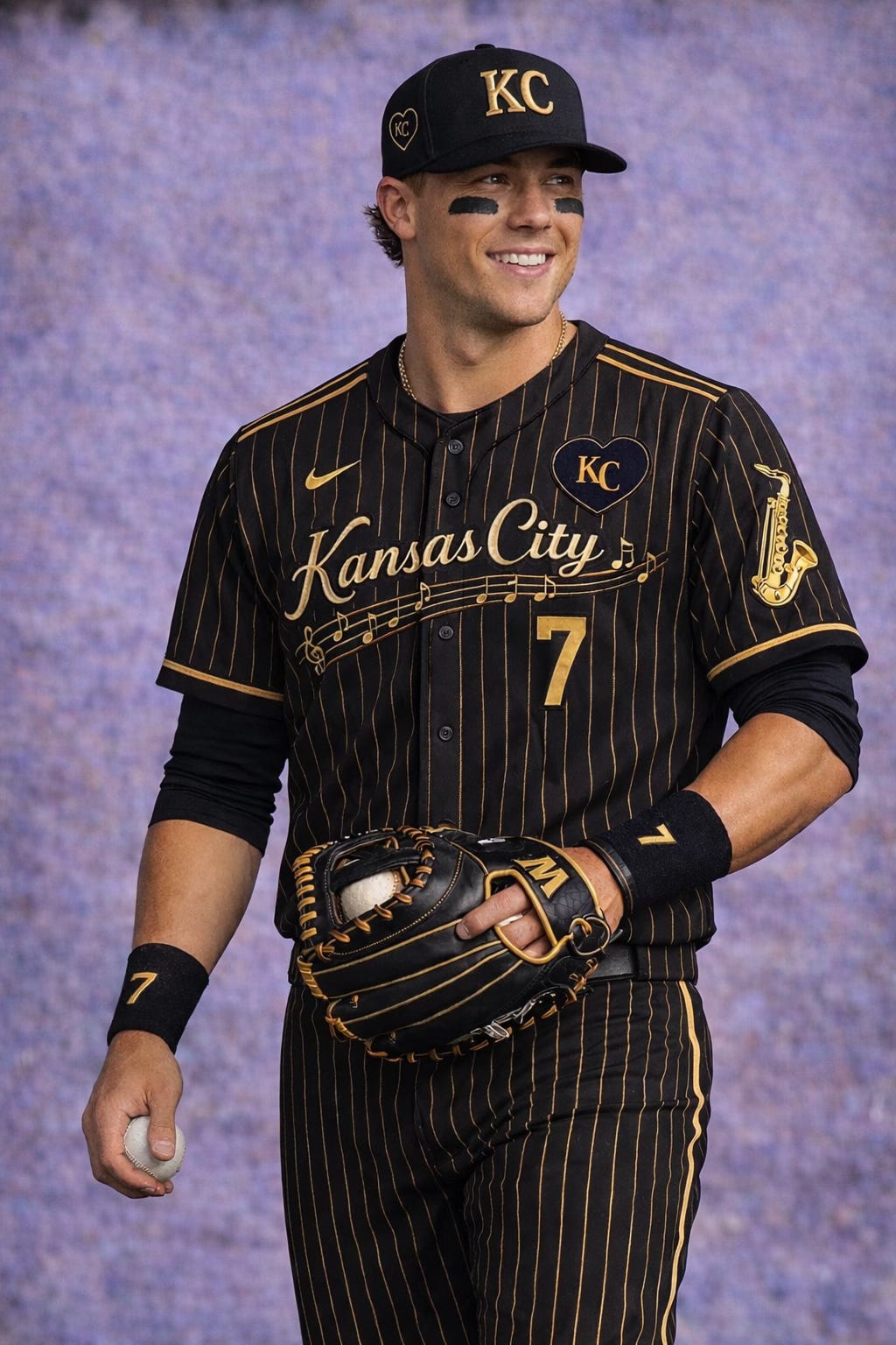
2. 18th & Vine (Jazz)
This one works on vibe alone.
Black and gold. Clean. Sharp. Tied to the historic jazz district. It feels like Kansas City at night. Music. History. Cool without trying too hard.
Not perfect — but it knows what it is. Oh yeah, and baseball, too.
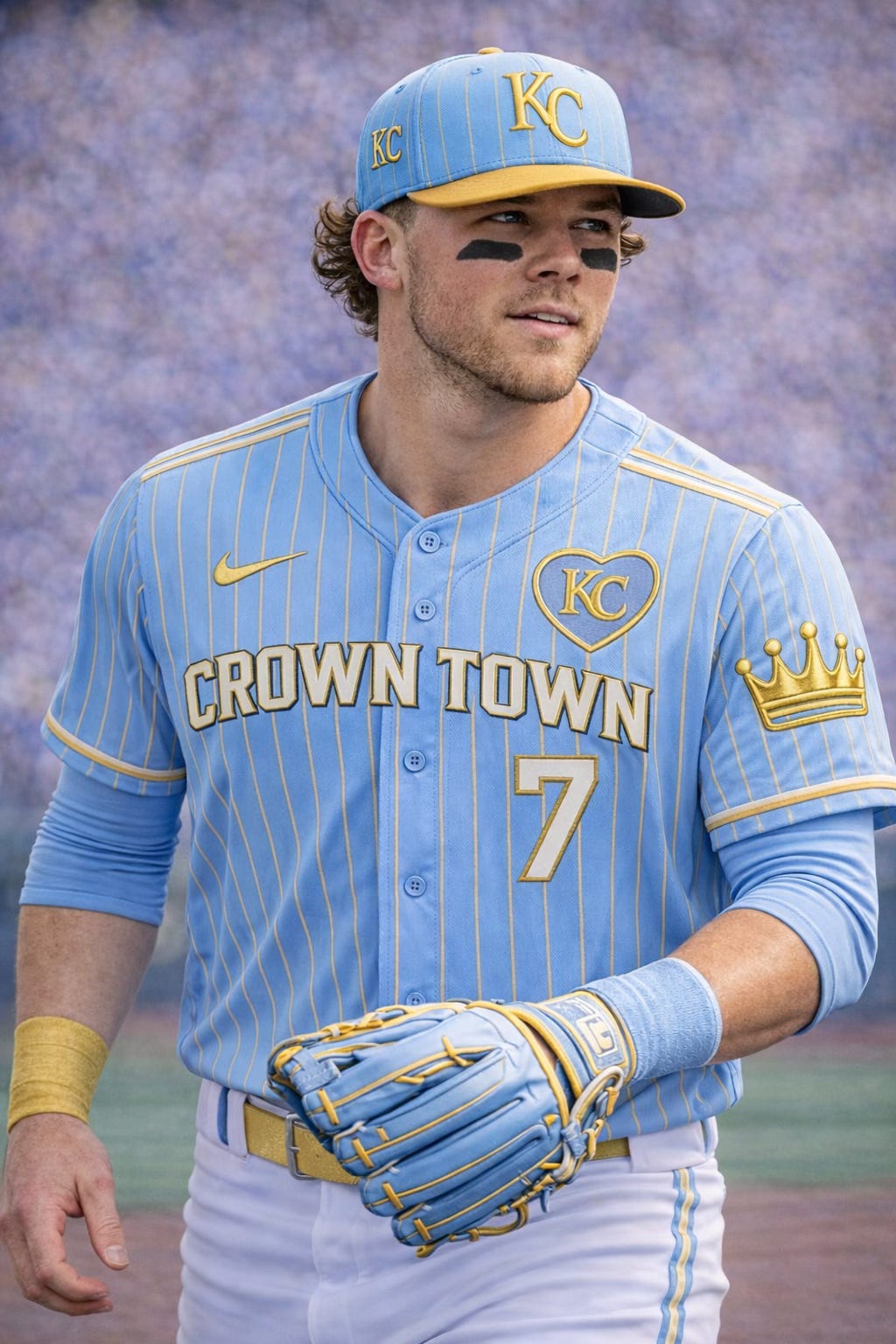
3. Crown Town
This might be the best overall.
Columbia blue. Gold accents. Clean lines. And most importantly — you know exactly what it is the second you see it. Kansas City. Royals. Baseball. No guessing. No explaining. No marketing campaign required.
That matters more than people think.
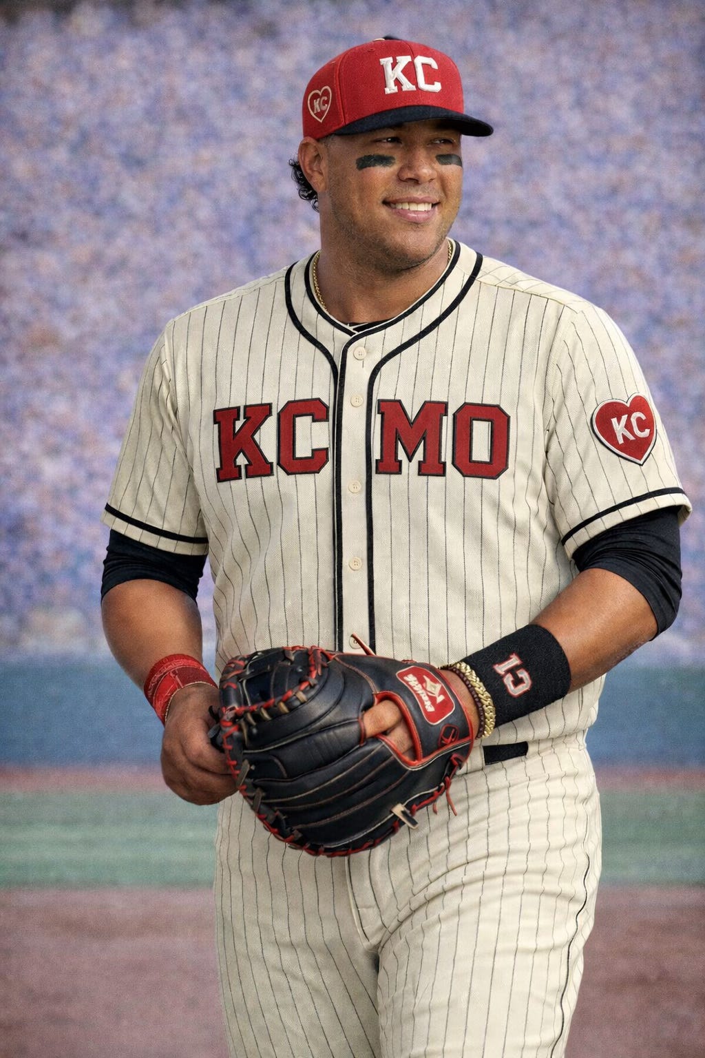
4. Monarchs (1945)
And then this one.
Inspired by the Kansas City Monarchs. Because Major League Baseball, in its infinite wisdom, decided the Royals can’t wear Negro League throwbacks anymore (I wrote about it last year).
So… fine. We tweak it. And wear them all season. KCMO on the front. Keep it simple. Keep it clean. Let the history speak.
And yeah — these look damn good.
Quick Grades on My Uniform Design Skills (Being Honest)
Heart of America → B- concept / C execution
18th & Vine → B
Crown Town → A- (B+)
Monarchs (KCMO) → A
Actual 2026 City Connect → D- (and that’s generous)
Final Thought
None of these are perfect. Maybe one’s an A-. Maybe.
But every single one of them is better than what the Royals — and Major League Baseball — just rolled out. Because at least these try to connect to something real. Instead of whatever that purple fountain experiment is supposed to be.
And yeah — people will buy it anyway. Because that’s the game now. But it doesn’t mean it’s good.
And that’s really the problem. This wasn’t hard. Kansas City has jazz, history, the Negro Leagues, a visual identity that actually means something — and instead we got another watered-down idea dressed up like innovation. The frustrating part isn’t that they missed. It’s that they didn’t even take the right swing. Because when you get a uniform right — when it actually connects — it doesn’t just sell for a season. It lasts. It sticks. It becomes part of the game. And this? This is just something we’ll be trying to forget by next year.